Wednesday
We presented our A to B mapping to the class and observed what the others did. There are some A to B map drawings that I liked and some that in my opinion needs to be improved on. Apparently, I kinda bent the rules because I supposed to use analog or digital to create the map. I didn’t draw any images such as key landmarks, I just photoshopped the map of media city to add an effect to make my A to B map look old.
I liked Christopher’s drawing because it reminds me of The Lord of the Rings map, very medieval like. The map shows the key landmarks of media city and it shows their A to B route very clearly. The font and the compass stood out and inspired me to use this in the future. One thing that needs improving is the background. Brown background or crunch up paper would be ideal for a medieval-like map.
I liked Chelsea’s drawing because the level of detail for each key landmark is spot on. Chelsea has chosen the canal, the cranes, and the Lowry theater. Chelsea also added a little twist, she drew monsters climbing over buildings and objects. I think the monsters represent the busy and tumultuous people in media city. It was quite hard to figure out her A to B route. An improvement for this map is to add arrows to show the route destination. Overall fantastic job!

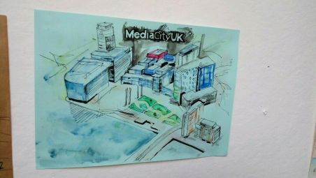
Matie’s A to B mapping is unique because he used watercolors to paint the map. I’m not going to use watercolors technique because it makes my work too messy/too much. An improvement for this map is to add key landmark and add arrows to show the A to B route because the majority of us in class struggled to identify Matie’s A to B journey due to the lack of detail.
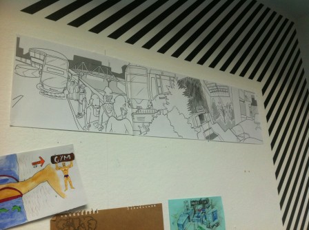
James’s A to B mapping is unique because he used the panorama effect to widen the field of view and it almost looks like a storyboard! which is cool and appealing! I may use this technique because it lets me add more detail or key landmarks if I widen the view. Jame’s has chosen the canal bridge, the bus stop, and the classroom where we study. An improvement for this map is to add some colour to make the landmark stand out.
From what I have observed, I have some talented classmates! They all have unique ways to present their A to B mapping. Some strudents motivated me to improve my A to B mapping, because we where to do it again but this time in a complete different field. I know that i must not use online images to present my mapping. This time I’m may use my clipstudio pro to draw my A to B mapping.
